
MoveNet
Digital-Promotion
© 2020-2025 All rights reserved.
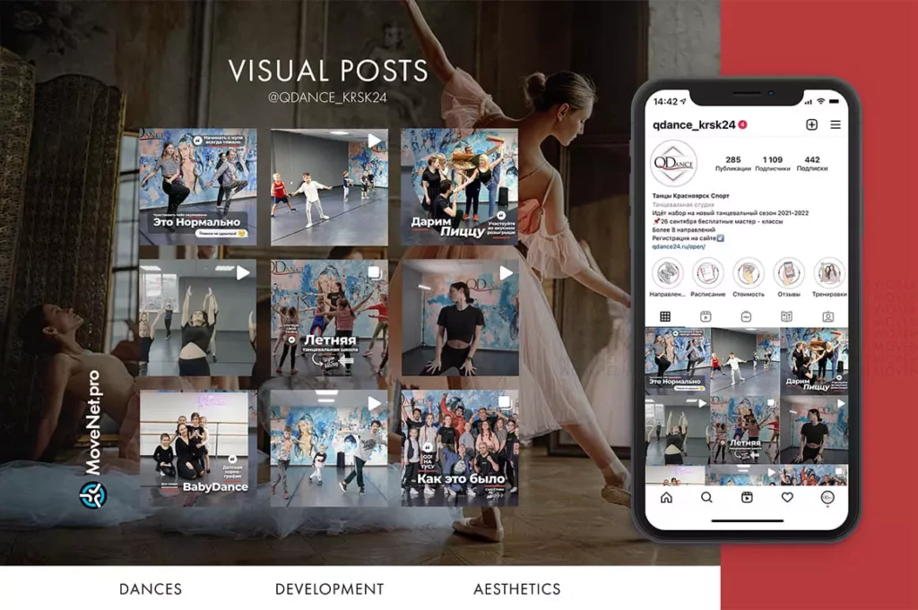
Dance Studio «QDance»


Description
Dance Studio «QDance»
Located in Siberia/Krasnoyarsk, the studio offers dance instruction and sports practices for children and adults.

